Casago Aruba Platform Redesign
Client · UX/UI · Product Design
Role: UX/UI Designer — UX Research, Information Architecture, UI Design, User Flow Optimization
Overview
Casago Aruba is a vacation rental platform helping travelers find private stays across Aruba.
The goal of this project was to improve the homepage experience by making property discovery clearer, more intuitive, and more aligned with how users actually choose accommodations. Especially first-time visitors unfamiliar with the island.
Rather than focusing purely on visuals, this redesign centered on structure, decision-making, and user flow.
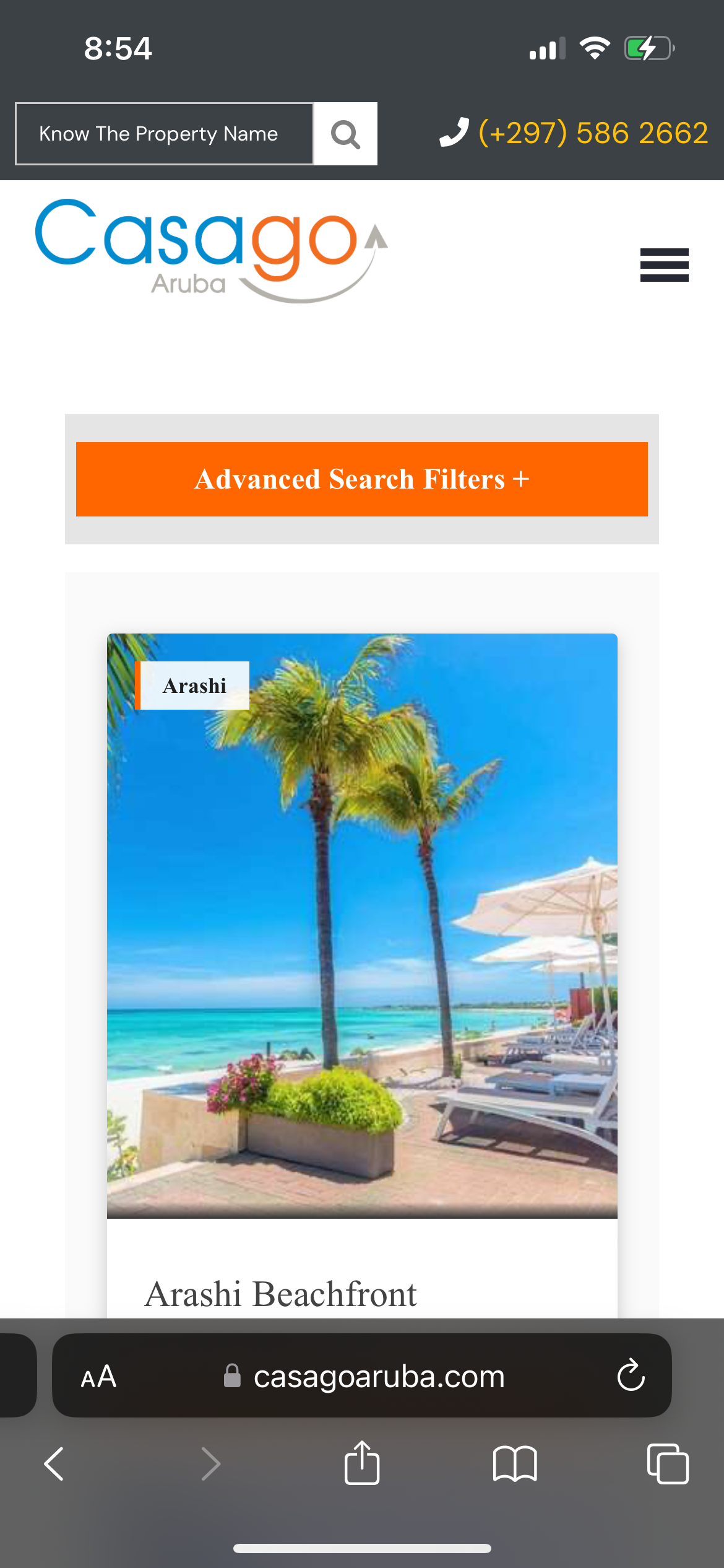
The Challenge:
The original homepage presented many villas at once, which looked appealing but created friction for users who didn’t yet know:
Which area of Aruba suited their travel style
How locations differed from each other
Where to start browsing
Users were being asked to choose a property before understanding the island.
This created cognitive overload and slowed down decision-making.
The key challenge became:
How might we help users orient themselves first : before asking them to pick a villa?
Design Direction
I reframed the homepage structure from property-first to area-first.
Instead of leading with “Featured Villas,” I introduced an Explore by Area section, highlighting key regions of Aruba (such as Noord, Palm Beach, Malmok, and Savaneta).
Each area card includes:
A short personality-based description
A representative image
A clear call to action
This allows users to:
Discover Aruba by vibe
Choose an area that matches their travel style
Then explore villas within that context
The experience shifts from browsing listings to discovering destinations.
Visual Hierarchy
Area cards were designed to feel scannable and inviting, using:
Strong imagery
Clear titles
Short descriptive copy
Consistent layout
This improves clarity while keeping the experience visually light.
Outcome
The redesigned homepage delivers:
Clearer entry points for first-time visitors
Improved discoverability through location-based browsing and Added FAQ.
Reduced cognitive load
A more intuitive travel journey for more trust value.
Instead of immediately selling properties, the platform now introduces Aruba first. We now let users find themselves in the destination before choosing where to stay.
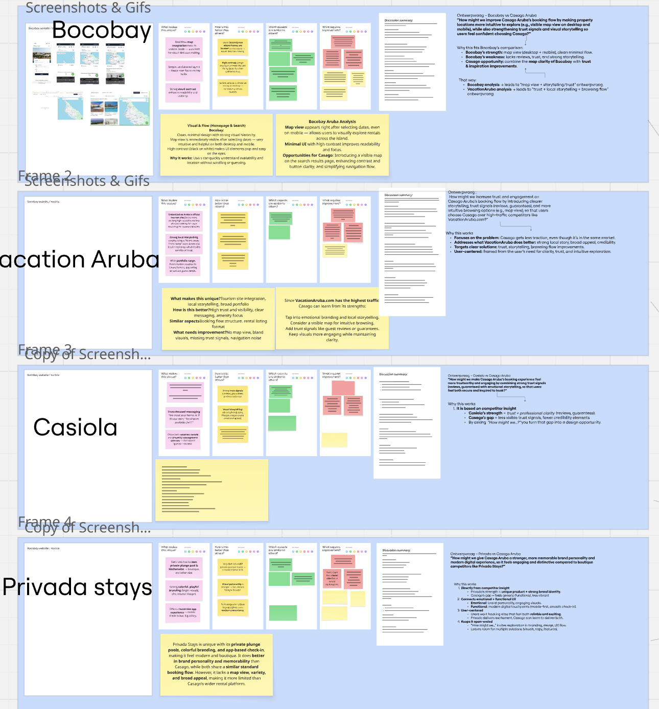
Research & Insights
Through reviewing existing flows, stakeholder input, and heuristic UX analysis, I identified a core behavioral pattern:
People don’t start by choosing a house.
They start by choosing a place.
Travel decisions are often location-led:
Beach vs city
Quiet vs lively
Local vs tourist
Showing random villas too early skipped this mental step.
Key Insight
Users needed spatial context before product selection.
They first wanted to understand Aruba and then explore accommodations.
UX Improvements
Information Architecture
The homepage hierarchy was adjusted to:
Hero → Trust signals → Explore by Area → Villas → Concierge → FAQ
This creates a more natural journey:
Orientation → Exploration → Selection → Support.
User Flow
Before:
Landing → Random villas → Confusion
After:
Landing → Area discovery → Targeted browsing → Property selection
This reduced friction by aligning the interface with real user intent.

Reflection
This project reinforced an important UX principle for me:
People don’t think in features.
They think in context.
By restructuring the homepage around place rather than product, I learned how small IA changes can dramatically improve clarity and confidence in user journeys.
If continued, I would validate this flow through A/B testing and session recordings to measure engagement per area and conversion improvements across the funnel.
Design Process
-
UX/UI Designer - responsible for user research, wireframes, prototyping, and interface design.
-
The challenge was to help visitors orient themselves more quickly and find the right accommodation within a large villa offering.
-
I analyzed the existing homepage and user flow and gathered feedback on where users experienced friction. This showed that visitors struggled with choosing a location and that the page structure was not always clear.
-
Based on these insights, I restructured the homepage and transformed the villa section into an “Explore by Area” layout. I also created wireframes and prototypes to improve navigation, hierarchy, and calls to action.
-
After internal feedback and alignment with marketing and development, I iterated on the designs multiple times, refining decisions based on user insights and technical feasibility.
-
The result is a clearer user flow and improved orientation for visitors. I learned to better support my design decisions with research and became more confident making choices within a multidisciplinary team.